
Redesigned iCloud Website with App Tiles Now Available for All Users
Apple has finally rolled out a revamped version of the iCloud website, featuring app tiles instead of icons. This redesign is expected to bring about a fresh experience for users who prefer accessing their cloud storage services through a web browser.
Why the Redesign Matters
While many people are accustomed to using native apps on their iPhones, iPads, or Macs to access iCloud, this redesigned website will undoubtedly be a welcome change for those who frequently use the web interface. This redesign is particularly beneficial for individuals who:
- Use different computers at work
- Have an iPhone and a Windows laptop
- Need to access and edit files across various devices
The new design allows users to quickly access their photos, documents, notes, reminders, and other important files without having to navigate through multiple menus. Moreover, the iCloud website is now more intuitive and user-friendly, making it easier for anyone to manage their cloud storage services.
A Brief History of the Redesign
According to MacRumors, Apple has been testing this new design with app tiles for several weeks before releasing it to all users. The redesigned website features a cleaner and more modern layout, providing users with an improved experience when accessing and managing their iCloud content.
Legacy Design vs. New Design
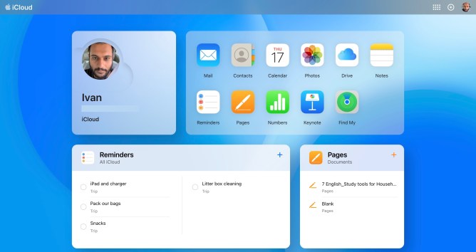
The original iCloud website displayed app icons when users logged in, whereas the new design showcases detailed information under each app tile. This includes recent reminders, notes, documents, pages, and photos. Additionally, a launcher tile is available to quickly access some of the apps.
Customizing the Website Layout
One of the standout features of the redesigned iCloud website is its customizable layout. By clicking on the ‘Customize’ button, users can move app tiles around or remove them as needed. This flexibility allows individuals to tailor their web interface to suit their specific needs and preferences.
Accessing Features with Ease
The new design also makes it simpler to create new documents, reminders, notes, presentations, and spreadsheets. Users can click on the + sign in the top menu bar to access these features directly.
Furthermore, the grid icon on the menu bar provides easy access to various apps, as well as options for checking storage capacity and changing subscription plans.
Conclusion
The revamped iCloud website is a significant improvement over its predecessor, offering users a more streamlined and user-friendly experience. With this redesigned interface, Apple has made it easier than ever to manage cloud storage services across multiple devices.
Whether you’re an individual or a business owner, the new design ensures that you can quickly access your important files, photos, and other content without any hassle. The iCloud website’s customizable layout and intuitive features make it an essential tool for anyone who needs to manage their digital life effectively.
Additional Resources
For more information on Apple’s latest updates and releases, be sure to check out the official Apple website or follow reputable tech news sources like TechCrunch.